When people think about UX or Product Design, they usually think about wireframes, prototypes, or beautiful interfaces.
And they're right—those things are an important part of our job.
Visual consistency matters. Brand guidelines matter. Design systems matter.
But during one of my projects, I learned something that completely changed the way I approach design:
Not every UX problem needs a redesign.
Sometimes, the biggest opportunity isn't improving a screen—it's improving the system behind it.
Prefer Watching Instead?
If you'd rather watch than read, I also created a short video where I walk through this case study and explain my thought process—from identifying recurring UX problems to proposing a scalable frontend solution.
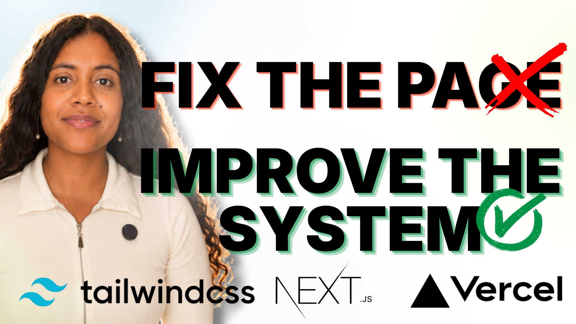
Otherwise, keep reading for the full story.
Looking Beyond Individual Pages
I was working on a large e-commerce platform when I started noticing a pattern.
The same problems kept appearing over and over again.
- Accessibility issues.
- Mobile responsiveness challenges.
- Performance bottlenecks.
- Broken layouts.
- Even recurring technical fixes.
At first, these looked like unrelated issues happening on different pages.
But after spending time observing the product, talking with stakeholders, reviewing usability, and analyzing the platform, I realized something important:
These weren't isolated page problems.
They were symptoms of a much larger frontend challenge.
That realization completely changed the questions I was asking.
Instead of asking,
"How do we fix this page?"
I started asking,
"How do we improve the system that creates these pages?"
UX Is More Than Interfaces
One of the biggest lessons I've learned as a Product Designer is that UX isn't only about what users see.
It's also about understanding the systems that shape the experience.
If the foundation of a product makes accessibility difficult, performance inconsistent, or simple updates complicated, users eventually feel those problems—even if they never see the technology behind them.
Sometimes the interface is only showing the symptoms.
The real challenge lives underneath.
Finding a Better Solution
As I explored possible solutions, I had to think beyond design.
I also had to consider the business and the internal teams.
A complete platform migration would have required new tools, new workflows, additional training, and significant time and cost.
The teams already had processes that worked well for managing products, content, and orders.
Replacing everything simply wasn't the best answer.
Instead, I researched a modern frontend approach that could improve flexibility while preserving the backend systems the business already relied on.
The goal wasn't to rebuild everything.
The goal was to build on what already worked.
Why This Matters for Users
Users don't care what technologies power a website.
They care about results.
- Can I find what I'm looking for?
- Can I complete my purchase?
- Does the website work well on my phone?
- Is it fast?
- Is it accessible?
By creating a stronger frontend foundation, it becomes much easier to improve all of those things consistently across the product.
Instead of constantly working around technical limitations, teams can focus on solving real user problems.
Why This Matters for Teams
Great UX isn't only about customers.
It's also about the people building and maintaining the product every day.
One thing I really liked about this approach was that it balanced innovation with practicality.
Teams could continue using familiar tools and workflows while gaining a frontend that was easier to improve over time.
That meant fewer workarounds, fewer dependencies, and more opportunities to focus on creating value instead of fixing recurring issues.
My Biggest Takeaway
This project reinforced something I now carry into every Product Design project:
The best UX solutions don't always start with redesigning the interface.
Sometimes they start by understanding the system behind it.
When we stop treating recurring issues as isolated problems and start looking for their root cause, we create solutions that benefit users, support internal teams, and scale with the business.
For me, that's what Product Design is really about—not just designing better screens, but building better foundations for great user experiences.
Simple Explanation of the Technical Terms
If you're not familiar with the technologies I mentioned in the video, here's a simple explanation:
Frontend
The part of a website that users see and interact with.
Backend
Everything working behind the scenes, like products, orders, customer data, and content.
WordPress
A tool that allows teams to easily manage website content without coding.
WooCommerce
An e-commerce platform built on WordPress that manages products, orders, payments, and customers.
Next.js
A modern technology used to build faster and more flexible websites.
Tailwind CSS
A tool that helps developers build consistent and responsive interfaces more efficiently.
Vercel
A platform that hosts websites and makes them faster and easier to deploy.
Headless Architecture
An approach where the frontend and backend are separated, allowing each one to improve independently while still working together.
REST API
A communication bridge that allows different systems to exchange information.
GraphQL
Another way for systems to communicate, often sending only the information a page actually needs.
Responsive Design
Designing websites so they work well on phones, tablets, laptops, and desktops.
Accessibility
Designing products that everyone can use, including people with disabilities.
Scalability
The ability for a product to grow and improve without becoming difficult to maintain.
Thanks for reading! I hope this case study gave you a better understanding of how I approach Product Design—not just by improving interfaces, but by thinking about the systems behind them. If you'd like to see more UX case studies, design insights, and AI workflows, feel free to connect with me or check out my other content.
Comments
Be the first to leave a comment.